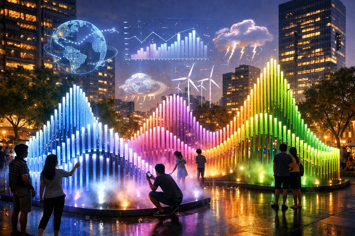

In a bustling urban square recently, a cascade of shifting colors ripples across a transparent dome as if capturing the aurora borealis on the pavement. But rather than drawing on motion sensors or prerecorded loops, this artwork is synchronized to live satellite readings of polar ice thickness. As the data dips and swells, the LEDs embedded in the structure pulse in vivid gradients, making the invisible rhythms of a distant ecosystem suddenly tangible.
This trend toward data-driven ephemera marks a turning point in public art. Traditional monuments stand frozen in stone or metal, but these new installations rely on real-time feeds-climate indices, ocean temperatures, glacial mass measurements-to drive ever-evolving visuals. Their transient nature underscores an urgent ecological narrative: as the underlying data shifts, so too does the form, reflecting the impermanent state of our planet’s fragile systems.
One standout project, titled “Shifting Currents,” debuted last spring in a reclaimed waterfront park. A network of curved acrylic fins, each fitted with addressable LED strips, arcs over a shallow pool. Connected to a cloud API that tracks sea-surface temperatures, the fins glow in warm reds when ocean heat anomalies spike, then cool to blues and greens when conditions normalize. Visitors can scan QR codes to switch between local, regional, or global datasets, layering their own perspectives on the installation.
Behind each such work lies a blend of creative coding and off-the-shelf electronics. Microcontroller boards handle data ingestion, parsing JSON-formatted feeds from environmental research platforms. Programmable LED modules translate numeric values into color maps. Portable projectors add dynamic overlays, projecting animated infographics onto nearby walls. Architects of these pieces often prototype with open-source hardware and general-purpose sensors, emphasizing sustainability by choosing components with low power footprints and recyclable materials.
Beyond the glowing spectacle, these installations foster curiosity about data itself. Instead of burying raw numbers in reports, they invite tactile exploration. A passerby might hold a hand near a proximity sensor to trigger a deeper dive into seasonal precipitation trends, displayed via animated glyphs on an adjacent LCD panel. By making information sensorial, the art encourages non-specialists to engage with climate science on an instinctive level.
Privacy concerns have even found their way into the design ethos. While many interactive works log anonymous user interactions to refine responsiveness, project teams stress that no personal identifiers are captured. Public kiosks offering deeper context operate on isolated networks, ensuring that participants can explore data layers without leaving tracking breadcrumbs behind. This combination of transparency and privacy safeguards reflects the values of both curious audiences and ethically minded creators.
Logistical challenges abound when art depends on continuous data streams. Service outages or API changes can freeze visuals or erase archives. To guard against dark spots, technicians often build fallback routines that default to historical records or smoothly loop the last valid sequence. Some projects run redundant sensors on site-measuring local air temperature and humidity to match the remote datasets-so the work remains vibrant even if the primary feed lags.
The environmental footprint of these luminous spectacles also demands scrutiny. Organizers commonly deploy solar-charged power stations to run microcontrollers and LED arrays off-grid. Lightweight photovoltaic panels perched atop nearby kiosks recharge battery packs during the day. After dusk, the installations run entirely on stored energy, minimizing reliance on municipal power and aligning with the very ecological messages they convey.
Community engagement often extends the life of a project beyond its scheduled run. Workshops teach neighborhood groups how to assemble basic sensor modules and program LED patterns. Local schools collaborate on data-visualization contests, contributing new color schemes guided by student-developed algorithms. This participatory layer transforms spectators into co-creators and cements a collective sense of stewardship over both the data and the physical installations.
Despite these successes, some critics question whether the fleeting glow of data art can drive lasting change. After all, once an exhibit moves on, so do the crowds. Advocates respond by pointing to web archives and mobile apps that capture each installation’s lifecycle, preserving the visuals and data streams for posterity. Visitors who scan on-site NFC tags can revisit interactive experiences months later, tracking how the underlying environmental metrics have evolved since the original unveiling.
The philosophical underpinnings of this movement draw on a fusion of ecological awareness and digital minimalism. Where some artists have approached data art as purely abstract pattern-making, today’s practitioners emphasize context. Every color shift, every luminous wave, is annotated-either through companion websites or through discreet placards-so that the audience understands why a spike in ocean acidity turns a sculpture from emerald to scarlet.
Early adopters are already looking ahead to networked cityscapes, where multiple installations across different neighborhoods share synchronized data narratives. Imagine a chain of illuminated arches along a riverfront, each segment responding to water-quality readings in the watershed above. Passersby would walk through an evolving data story, experiencing the journey of a single raindrop from cloud to stream to estuary.
Augmented reality also beckons as a next frontier. By donning lightweight headsets or using smartphone apps, viewers could overlay additional data points-like carbon-flux diagrams or predictive climate models-onto the physical pieces. These virtual strata would enrich the sensory experience without altering the existing hardware, offering multiple layers of interpretation for both casual visitors and dedicated researchers.
As public art continues to intersect with environmental data, its role shifts from decorative to diagnostic. The city becomes a living laboratory, and every glowing installation serves as a real-time barometer of planetary health. By embedding scientific feeds into organic forms, artists are not only crafting memorable spectacles but also cultivating a deeper emotional intelligence toward the natural world.
In the end, these installations do more than illuminate plazas and parks-they spotlight our collective responsibility. When a sculpture dims because polar-ice readings fall below a critical threshold, the community feels a shared urgency that a static plaque could never evoke. Through light, color, and code, data-driven art is forging fresh pathways of connection between people, technology, and the environment.
Whether you encounter one of these projects on a weekend stroll or in a curated night-time festival, its resonance lingers. Each flicker, each gradient shift, is a reminder that the world outside our screens is constantly in flux. And by translating those unseen motions into vibrant displays, creativity and curiosity join forces to spark conversations and, perhaps, ignite the will to safeguard the planet we all call home.
-
Maximus XII Hero (WI-FI) Desktop Motherboard - Walmart.com
RP2040-Zero Microcontroller Development Board Motherboard Processor Microcontroller. 2 options. Available in additional 2 options. Options. $1053. current price ... -
KEYESTUDIO Leonardo R3 Microcontroller Development Board ...
KEYESTUDIO Leonardo R3 is an ATmega32u4 microcontroller board. The Leonardo differs from other Arduino boards using separate USB-Serial chip in that the ... -
Mega 2560 R3 Board for Arduino Projects with USB Cable - eBay
Keyestudio Mega 2560 R3 is a microcontroller board based on the ATMEGA2560-16AU, fully compatible with ARDUINO MEGA 2560 REV3. It has 54 digital input/output ... -
Juno V4: A Custom Designed AVR Microcontroller Communication ...
Juno V4: A Custom Designed AVR Microcontroller Communication Development Board - The Ultimate Maker's DIY Electronics Kit. Flyandance. 5 out of 5 stars. -
ALEKO Gate Opener Range Adjustment Board for Exit Wand | Wayfair
You'll love the ALEKO Gate Opener Range Adjustment Board for Exit Wand at Wayfair - Great Deals on all products with Free Shipping on most stuff, ...